This project focuses on human emotion; you need to create a box with 3 difference shape that described a strong emotion. For example, you can find that loneliness was a common theme in many songs, and you can express and show loneliness manifested in a shadow box through color scheme and lighting.
Mixed media is to encourage student to explore type of material to create unique pieces of assemblage box art that are inspired but remember color is the main subject. Each box measurement about 15x15x15inch.
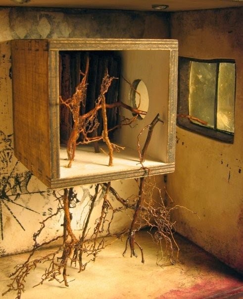
These are some of the examples of the emotion boxes we could have an idea on :


![]()


.jpg)


Mixed media is to encourage student to explore type of material to create unique pieces of assemblage box art that are inspired but remember color is the main subject. Each box measurement about 15x15x15inch.
These are some of the examples of the emotion boxes we could have an idea on :
With that known, we now had to choose an emotion and there after carry a research on what we shall need to make our emotional box.
Chosen Emotion : HAPPINESS
Research
Happiness is a mental or emotional state of well-being characterized by positive or pleasant emotions ranging from contentment to intense joy. A variety of biological, psychological, religious, and philosophical approaches have striven to define happiness and identify its sources. Happiness can be described as thought of the good life, freedom from suffering, flourishing, well-being, joy, prosperity, and pleasure.
How else we can explain happiness
- Laughter
- Pleasure
- Joy
- Jubilation
- Cheerful
- Rejoice
- Delight
Laughter
Rejoicing/Cheerful
Pleasure
With a general understanding of what happiness is and could be described, it was now time to set and look at the colors that can be used to show this specific emotion.
Colors that represent happiness, joy are mostly seen as vibrant and colorful because joyful is something that is expressed widely and something that is bulk and has no limit so a mixture of these colors can be seen when regarding ‘happiness’.
We can see that from the images above that the colors that represent happiness are bright and vibrant. Some of these colors that we can see are :
- Blue
- Yellow
- Red
- Green
- Pink
- White
Most of these colors are normally of a bright color/shade because this emotional shows a lighter side and hence the shades are normally of bright contrast and saturation.Colors can make us feel happy or sad. They can make us feel hungry or relaxed.
As a designer, it’s important to understand the psychological effects colors might have on an average person, or a company’s target audience. Lets take a closer look at the color wheel:
Warm Colors
Yellow is a cheerful color associated with sunshine and happy faces, so it’s a natural choice for happiness. Be careful, though, before decking yourself out in all yellow— it’s very stimulating and known to cause aggression. If you’re a withdrawn person, though, trying to get up the courage to go out and find happiness, yellow is a great choice.
Orange, likewise, is a color of joy and energy. Warmer and more enthusiastic than sunny yellow, orange gets you excited and lifts the spirits.
For a calmer contentedness, try getting ‘in the pink’. Pink reduces feelings of loneliness. It’s calming and soothing, youthful and feminine.
Red, orange, and yellow are next to each other on the wheel and are all warm colors. Warm colors often evoke feelings of happiness, optimism and energy.
Red is the warmest and most dynamic of the colors – it triggers opposing emotions. It is often associated with passion and love as well as anger and danger. It can increase a person’s heart rate and make them excited. If you want to draw attention to a design element, use red. But use it as an accent color in moderation as it can be overwhelming.
Orange enhances a feeling of vitality and happiness. Like red, it draws attention and shows movement but is not as overpowering. It is aggressive, but balanced – it portrays energy yet can be inviting and friendly. Orange is great for a call to action to buy or subscribe to a product.
Yellow is perhaps the most energetic of the warm colors. It is associated with laughter, hope, and sunshine. Accents of yellow help give your design energy and will make the viewer feel optimistic and cheerful. However, yellow tends to reflect more light and can irritate a person’s eyes. Too much yellow can be overwhelming and should be used sparingly. In design, it is often used to grab attention in an energetic and comforting way.
Earthy Hues
White and brown are both good for a break from too much stimulation. White is purifying and cleansing—it’s the light at the end of the tunnel that we all want to see. Brown reminds us of stability, making it good for finding even ground when you everything is up in the air.
Cool Tones
Dark greens are calming and bring to mind growth, which is good for work on self-improvement.
Blue is well known to be the most calming of all colors, particularly deeper shades. Light, powdery blues are good for happiness. Be careful wearing dark blue, though, which is also linked to sadness, loneliness, and having "the blues".
Above all, use your personal associations. If your childhood bedroom was cherry red, and that color makes you think of good times you had growing up, wear or carry something cherry red to evoke those memories. If purple is your favorite color and it makes you smile to see it, wear a purple shirt, or make sure there's something purple on your desk. Everyone has their own personal thoughts about colors, in addition to the usual subconscious reactions. When choosing a color palate in your life that will make you happy, don't ignore your own preferences.
After knowing and giving a brief view and show the usage of the colors that were going to be used in this box, i set out to look for images that showed happiness/joy/cheerful. Be it painting, images, drawings. These were to open my mind up on how I would make my box and what content it would have inside. These are images that I found with a significance with happiness.
I personally chose paintings because this is what I wanted to use on my box when I make it, using of vibrant colors and would paint images that would give me my whole idea of the box.
Looking at examples of the boxes that were done by some students, like the ones below :
These opened my ideas that i was thinking on how to make my box and this was an eye opener and after looking at some examples, I chose one sample that I was to have a reference to when making my box.The sample is shown below:
These samples had sheets of different artwork/designs on them and showed different samples but of the same emotion regarding what they picked.The were laid up one behind the other in a 'box' which was to made and then have the images slotted in.
With this idea and knowledge gained, it was kind of easy to know how i was going to make my box with the paintings regarding 'happiness'. Discussions with my lecturer were discussed with my lecturer to see how we can make this possible and we also came out with rough sketches that would be simply understood with the explanation.
Sketches
After sketching out a few ideas and all, I told my lecture that I was going to use PVC plastic paper sheets that will have to be either stuck on a box or suspended. We then sketched it out and came up with a U-shaped box to which was the one that I would make and then have the sheets of acrylic paper with their art on them. He talked about having me using certain techniques that could make my work good. These were :
Splashing of paint
Paintbrush splattering is the most common way of splatter painting. It involves using a paintbrush dipped in paint to achieve the desired look. However, you can change the way your paintbrush splatter looks by using a variety of sizes and shapes of paintbrush. Each one will yield a different result. Also, you can use glaze or water to thin your paint a little, which will make it a little more easy to splatter all over. One part glaze to one part paint is enough to make the paint more malleable in terms of how you can move it around your wall or your project.
Stencil Painting
Stencil painting is when you use a stencil to paint a pattern or picture onto something. The stencil makes it very detailed and exact. This technique is often used on walls. A stencil paint brush is usually round and short and stubby. Mostly you have a stencil shape and instead of the usual brush strokes of painting, you use a short stabbing motion with your brush. If you have a lot of paint on your brush, you make a darker pattern than if you have less on it.
From then on, it was then a general mindset on how I would go around designing my work. After that understanding, it was now the production of the box.
BOX PROCESS MAKING
The process of the box will be shown by the images on how I went about with most of the work and descriptions will be added where necessary. Materials that were going to be used are shown below.
- PVC plastic sheet
- Oil paint
- Brushes
- Spray paint
- Metal rods for box
- Wire cutter
- Paper for stencil
- Perforater
Some of the materials will be shown as the process goes on.
Spray paint that was going to be used where necessary.
Oil paint that was used for painting.
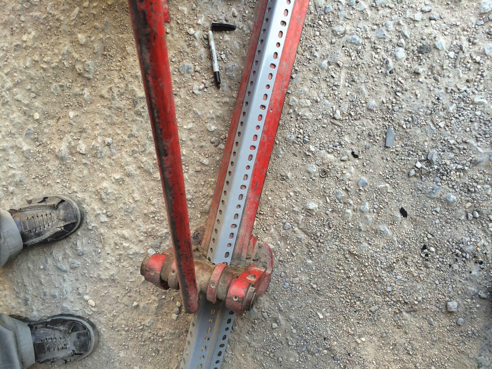
The long metal rod that was cut into 10 pieces.
Each piece was measured to 15 inches.
After being measured, the pieces were then cut equally.
In my hands were the 10 pieces that were going to used to frame the box
Bolts and washers to tighten the pieces together.
How the pieces were tightened
The frame of the box was complete and this was the outcome.
The U-shaped box just like the sketches.
This wire was the one that going to be used to tighten the art works to the frame.
Just about to spray paint the frame and make it colorful.
The use of the common vibrant colors, blue, yellow and red on the frame.
After letting it dry, this was the complete frame.
Hand drawn paintings were done to depict happiness which can be seen by the smileys.
Making a stencil that will be spray painted over.
After cutting the stencil out, we had the word ready to be sprayed on.
Spray painted over with a shade of the three colors used on frame.
This the outcome with the smileys and the spray painted canvas.
Balloons and bouncing balls to show happiness and colorful too. Splashed painting was also used.
Flowers can change the mood of a day and make you smile hence a painting of a flower was done to be added to the box of happiness.
We see a rainbow on rainy days which also shows compassion and that happiness shall rise. The boy playing with the balloon shows his having fun with the sun shining bright through the rainbow.
The hooks that were going to be used to hook the papers and the perforater to make the holes on the plastic.
These are the wires that were used to hook the paper to the frame, each were measured and cut to 15cm.
That is how the hooking with the wire was done to the art works and how they would hang from the frame.
FINAL PIECE OF THE BOX
That was the final outcome of my happiness box after all the research and ideas to come through. Was very pleased with the work and the way it came out. Was supposed to use a normal box but I didnt like the way the designing and the outcome would be done and hence i decided to make this U-shaped box which turned out good. The whole outcome was to have a variety of what happiness could be defined by and hence the different types of art pieces.