This final project being music related and also looking into the music industry, had to come up with a problem statement and then have a discussion of what we are actually making as a graphic designer and what we are to change.
Problem Statement
The monetization interaction between the promoter, audience and musical artist.
Summary
Looking into the problem that monetization between the relationship with the promoter, audience and the artist have faced and how digital technology can be able to enhance this relation by the use of this website and application.
Objective
I created this website in the sense that the relation of these three parties will be able to have a sentimental value that shall be sustainable that will be able to enhance all 3 parties with the monetization that has been faced through live performances that artists do to showcase their talent to their audience. The problem that I shall really tackle is the relation between the artist and audience through an event. The website/app is one way in which I shall form an interaction way to enhance value where it is necessary for those who do not attend the show and those who actually go for the show.
With the creation of my final project being discussed, I am to make an application and a website design as to which will show the relationship and the international between the three parties that being the artist, audience and the promoter all linked into one.
The website layout design will be divided into 3 parts which will be seen by:
1. Promoter
This is where the promoter of the show/event will enter certain criteria of the event such being the
name of the artist, time of the show, location of the show etc. The promoter will only be allowed to have the fill in type of design where it will be more informative to give out information out there to the audience.
2. Audience (Going/Not going)
Here is where we shall be able to see the information that the promoter has handed into the 1st form of information and then it shall be viewed on the website when a person visits the website preferably being the artists website. Here when the person clicks let's say, shows. They will be able to the where this artist is going to be performing and all the other information that was included like the prices and all. Here the audience will be able to buy their tickets online, register for online passes (live stream) where they will be able to like buy the pass if they won't be able to go for the show so that they can be able to view it online.
3. Online live stream
This is the layout that shall be viewed by those who do not attended the show and let's say bought an online pass to watch the artist live at the show. The audience will be able to view videos that people at the concert are able upload and then have a field where you can download some of the videos uploaded. They shall also be impulsive promotion of the artist merchandise such as buying new album/single of the artist, clothing line etc. Such to make the whole music experience worth while. The May so be a chat option where people can be able to talk to other users that are not at the show and have an interaction where they can have the feeling of actually being there and having that interaction experience.
The purpose of this design is to help improve the monetization problems that have been faced by the interaction between the three mediums. So as a graphics deigns, it is where design shall be carried forward as to how value can be added to each and every party of this application/website. As to how will the artist benefit from this? How will be audience benefit? Is it worth it? Is the process of live streaming actually worth it? Such questions will be needed to answer and looked into to carry out a design so as it can be able to sustain these loop holes that are faced by the parties above.
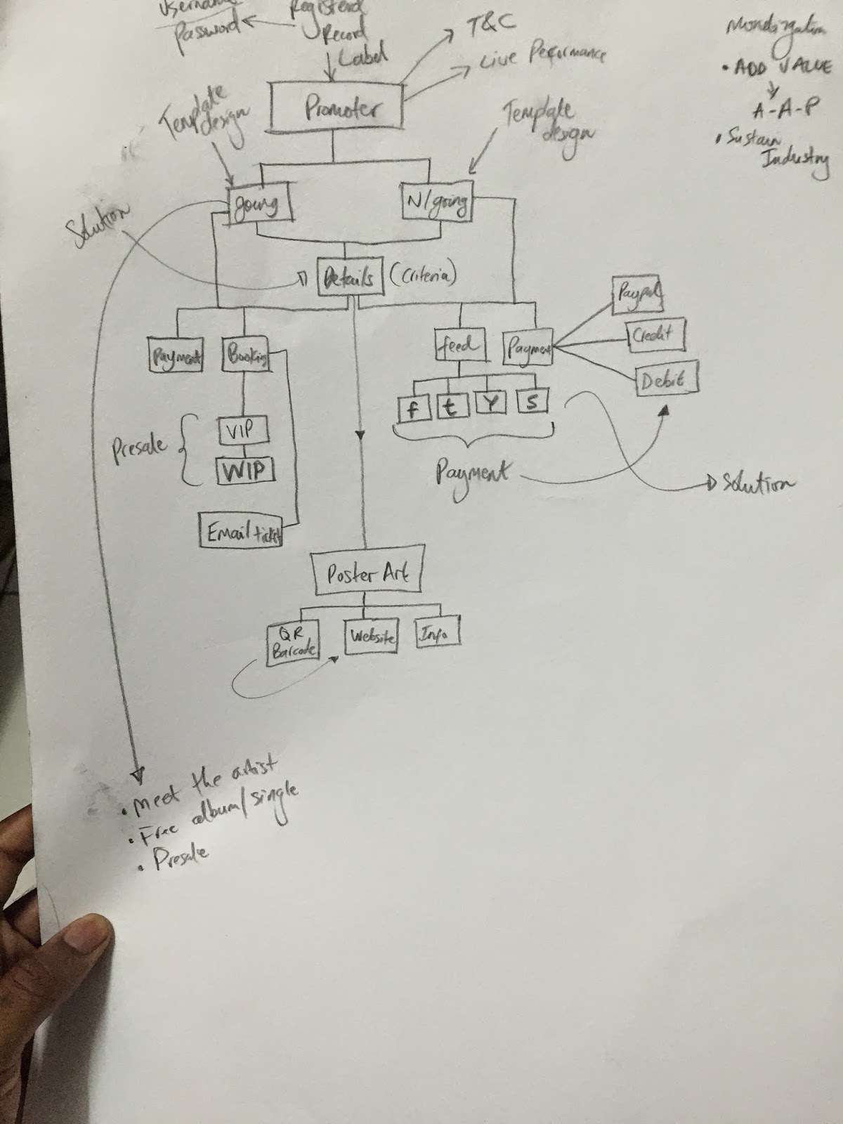
So with that description of what the forms will be showing by parties, I sketched out of like a plan as to how information shall be gathered as to help improve the quality of my final design and layout of this project.

So this shows how it moves from the promoter to the audience of those not going and going to the concert. It shows the benefits and other criteria that will be seen and have to be paid attention to by the parties above.
In relation certain things had to be pointed out like:
1. What will the artist benefit from this project?
2. How will the audience not going be able to benefit from it?
3. If I'm at the concert, what is there that will help me benefit or gain from the experience.
So these questions all in relation to the parties are important because they helped me in knowing what exactly is needed to be on the forms of the website and app.
The structure design is also like a breakdown as to what the website and the app are supposed to do and how it can be followed. With this being a sample of the structure as to how I would like the project to function. It would also have to come with a design and also a sleek interface that once seen by the user, it can be easy for functionality and accessibility and wont be hard for the users to use when they actually do.
Thereafter, I then sketched out designs as to how I wanted my skeleton project to look like. Due to there being 3 parties involved in this, that means that they are three designs that would have to be 3 types of designs and those being:
- Promoter Interface
- Streaming User Interface (Those not going)
- Audience (Going?not going)
I then started to sketch out my design and as you can see below, these are what I came up with a little description and summary as to how I designed it and also what type and how I came up with the reference to having such a design.
The promoter interface is one which is more of an informative type of design where the promoter will be able to enter information into the design and then apply these criteria of details entered to be seen by the viewers outside. So the design of this had to have like forms and labels where it will show where the promoter enters details such as:
- Date of show
- Name of artist
- Location of show
- Price of tickets
- Sid-lining artists etc.
So these are things that shall be entered and once entered by the promoter, when it published, it shall be published to a user interface template that the audience will be able to see and read this information gathered by the promoter himself.
This is one type of the designs layouts. Details to be filled in where the details tab falls in and then there was a selection of where the promoter can be able to upload a photo and which the users will then see the artist and all the information like the prices the tickets the promoter puts.
This the same type of design skeleton but different layout with shifting around with the details and make it more of a proper looking website/app once accessed.
For for the audience, they are two types, those that are actually going for the show and those not going, hence 2 designs are to be shown. For those who just visit the website, they shall see the information on that was entered by the promoter and then what things they shall be able to see or do on the website are
- Buy the tickets for the show
- Make bookings are reservations for tickets for other upcoming shows
- See the artists gallery of photos and videos of past shows (encourage people to actually go and see the artist perform live)
- Details about having to meet the artist at a particular place and time before the show.
The image above shows the type of informative design that shall be seen once the website is visited. It shall be a design template where it can easily be changed by what they promoter places in their section and then it easily changes on the user side. The layout stays the same except the information.
This type of informative will clean and very formal because it is just going to give out information to those who are interested in going and once you are, you can easily purchase your tickets and then it's done. You are going for the concert.
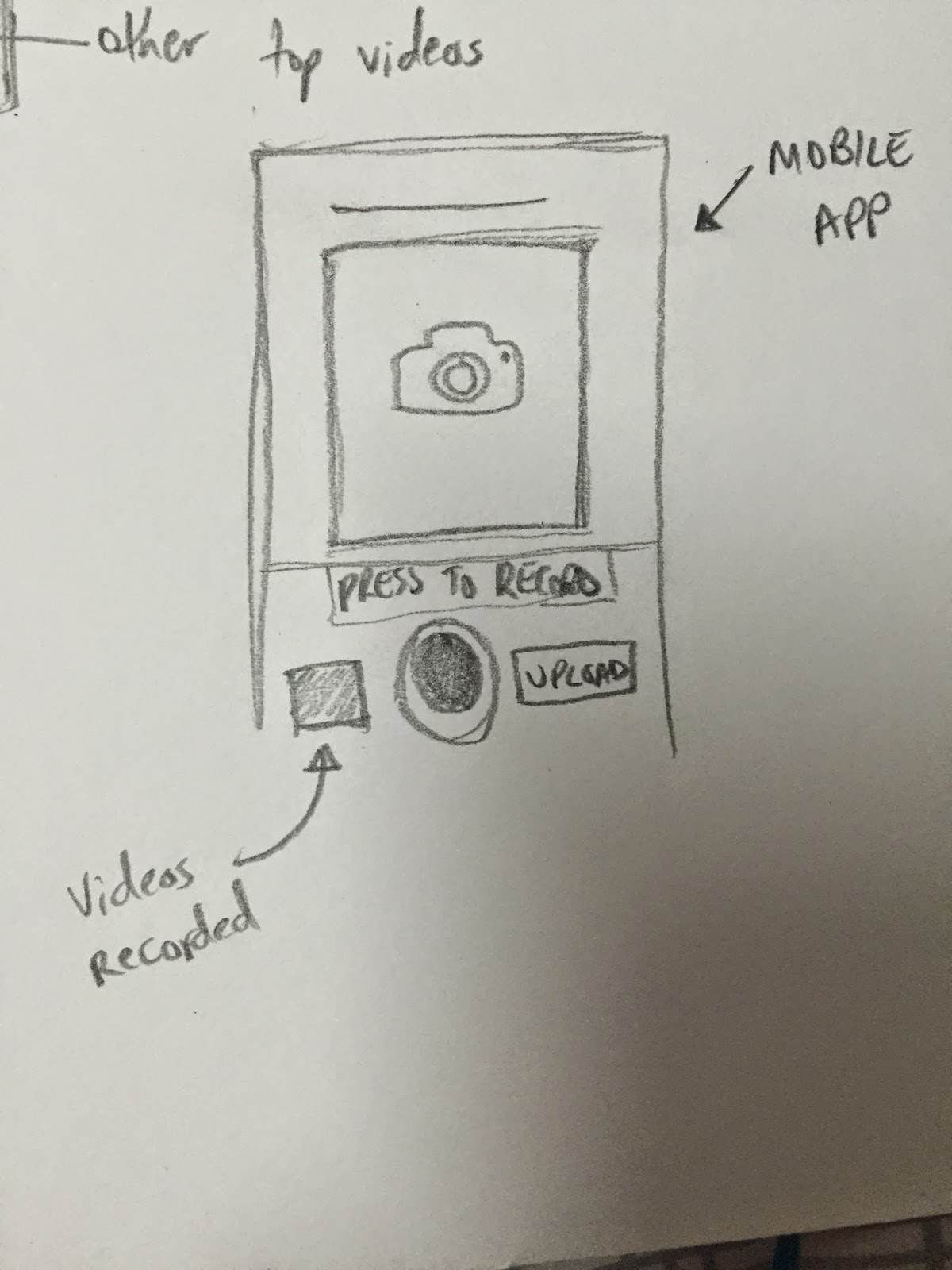
Those that are also going to the show will have access in downloading a mobile application that will give them the opportunity to record their favorite artist perform and then upload it to a feed where those that are not at the show are able to see what people are recording. So this is another interface that shall have a design with a camera box and then an upload button as to when the user finishes recording all he/she has to do is upload and then they can be doing that in intervals when they feel they need to.

The application will look just something above. It shall be easy and descriptive with the necessities that will be needed at the concert. Those being the camera that shall be used to record the artist perform and then also the upload button which when the user finishes recording, they upload it straight online. Another section that can be added is a videos recorded where the user can see the videos that they have just recorded the whole concert and choose which they can upload even after the concert is done.
There is then those that are not going for the concert who would still visit the websites /app. But Would still love to see the artist perform. So this form is where the shall see this artist perform and it will be a different type of informative design with just text and images but it shall have more precise details such as:
- The actual streaming of the show
- A chat where they user can chat with other people that didn't go for the concert
- A selection as to where can download videos that have been uploaded by those at the show
- Have a free sample listen to the artist new upcoming album/single.
These are to give the users that are actually not at the show to have that feeling of actually being at a concert and still having that type of connection with the artist as they perform live for an audience.
Above shows the samples of the design layout that I would like my streaming interface to look like with the common things like the video streaming section, the chat and all.
In ways to which I want to add value to this because that is also one aim for the use of my website/app to add value to all parties. So I included a section where the user can be able to like buy the artists new album/single in ways to encourage impulsive buyers.
With my sketches done, I then set out on the internet to look for samples and get an idea of how I improve my creativity on the creation of my designs and layouts for my project. What I was to look for on my search were:
- Informative forms where information is entered.
- The websites that have concert/show information.
- The streaming websites that show the streaming and all.
The Promoter
The idea of me getting these images above was to have an idea on how I can design the promoters side of layout. This one is a layout where information is to be entered so I set up to look for designs that have such type of layouts and these were just samples that I got to have the application type of feeling.
Audience Viewing shows online
The designs above are where users like me go to the Show/Tour tab on the artists website and then we get to see the dates and information of the next show. I noticed that it was kept really simple and that it just had typography with just the date, time and location of the event and then an option where the users are able to buy tickets. So this gave me an idea to have a simple and not too much information going out because all you want to do is inform the users what is happening. Certain impulsive advertisements were:
- Users being able to join a newsletter
- Latest song of the artist playing and being available for purchase.
- Videos playing of the artist which are popular.
These are certain things I should pay attention to in my design to also have such which can add value for my website/application.
Video Streaming Interface
The above images are samples of how streaming live concerts off websites look like and some of the necessities that they offer. As seen on my sketches, the layouts and set ups are mostly the same. Big screen with the usual volume tab, HD facility etc. There also small details which can add value to the designs such as:
- The chat facility
- Gallery to past shows
- Featured posts and videos from the show
These all add some sentimental value to the design and with my thinking and creativity, my idea of adding the buy music/album, to encourage impulsive buying by users to help benefit the artist even whilst they on stage performing those songs, people out there can actually be purchasing that song because they like they way it was performed live.
Mobile Recording At Show
Process of video recording.
Design Interface of the Instagram application
Sanpchat design interface
I then looked at how I would design my mobile recording application and that this would be some design that would have a record button along with my sketches to record and upload the video at the concert. I looked at famous social network applications Instagram & Snapchat that record videos and these would be used for reference in the sense of :
- Record button
- Upload button
- Filters
- Limitation of how long the videos shall be.
After having a sample of all the designs and layouts, I then set out to create a moodboard type of layout for a structure on how I would design my layout designs for all 3 of my parties. Below shows the draft layout of how I would design my promoter side of entry for details to be entered:
Promoter
As discussed and shown in my layout, this is a mock up of how I would set up the promoters side of the layout. The criteria to be entered and then have a section where the image shall be uploaded, due to it the viewers having to see a default design layout template, the images would always be fixed in one position where ever the layout is done. Then I shall have an option where give the audience the option to choose which payment method he will allow the audience to pay for their tickets. Either with
- PayPal
- Credit Card
- Debit Card
- Poster Order
Such type of payments will be applicable for those that are willing to purhcase the tickets


