Sunday, 29 July 2012

Revolution Or Evolution?

In this task, we were told to look at advertising and find an advert that appeals to us in such a way that it may be empty or can need improvement and also looking at the brand history to know the target group so ideas can be easy to work with.

With that in line, my brand that i was to work with was a sports brand called Nike.  

I did some research on the brand and found out that the Nike is one of the biggest sporting brands in the United States. The brand deals in clothing, shoes, boots,, accessories and sports equipment as well.

The above image was with one nikes big mogul, Cristiano Ronaldo standing with chest up infront of a simple back ground and the nike tick top right and website at the bottom.
  • To me, this advert was too simple and plain because it never gave that big feeling of nike. Nike being a big brand and Ronaldo being a big mogul, that meant that something big or attracting would need to be done and hence i chose this image and edited it to add more detail. So i edited it and added more detail in the image below :


From the image above, can see that it looks very different and not plain anymore. Color was added to give it that dark feeling that fades into black, nike logo was taken and placed on the chest and the motto 'just do it' was placed just underneath the shirt and also as a background text to show the imprint of the image. And because everything about nike was there and nothing about Ronaldo was there, i added a "cr7" at the bottom left corner with the same text color as the main text in the photo.


NIKE SHOES


Next was of a shoe type that is under Nike, this shoe is called "Dunk" and is incorporated with basketballers and just the whole concept of dunking. To me this advert was already more easy to work with but one who wouldnt know what type of shoe type this be would wonder where the 'dunk' concept is. And thats the idea that i wanted to add on.


The above image shows a more 'detailed' and more richer advert than the other. This one has a basket baller that is dunking and having that air feeling at the end of the shoes. To make it look more fine and more elegance i inverted the image to give it that cutting edge look, added a little blur and and smudged the baller in the direction of the movement. Then added another baller on the shoe which actually looks like the design of the shoe so this can give more attention to shop buyers that this is one of a kind sneaker. When looked closely can see a Miami Heat baller about to make a dunk. I then copied the same image and then flipped it horizontally and received it and added a layer mask then erased some parts necessary. This was just to add more deatil and also make it look attractive. "Dunks" Text was added at the bottom of the original text and had a gradient of colors picked out from the same image. Gave it more feeling and cutting edge. A faded rim was added at the bottom of the sneaker to add more emphasis on the 'dunk' effect.


With the changes made to these sample adverts, we can see that any advert that is paid attention to and analyzed properly can be made better. In other words, revolution overcame created ideas.

Analyzing Various Fonts Available

In this task, we were told to look at organic matter and inorganic matter and also the color textures that we would find in an image of choice.


So to begin with i had to find out what was the meaning of organic matter and non matter and research on the internet lead me to these explanations.
  • Organic matter - is matter that has come from a once-living organism; is capable of decay and one that has life in it. 
  • Non organic matter - Anything that does not contain any carbon like water. And one that would also not cause decay. One that doesnt have any life.
With the that taken note off, i looked for examples of each and from these examples, i would pick one that i would work with and analyze its texture. 
Some of the examples that i found for organic matter were those of living organisms that would decay later on. Such examples were :
  • Trees
  • Oranges
  • Grass
  • Feathers
Then with non organic matter these are the materials that i found :
  • Sunglasses
  • Chain
  • Bottle
  • Bracelet
These examples arose because the didnt not have any life or have any life that would cause any decay or die.

From the examples that i came up with, i had to pick one that i was going to work with either organic or non organic and examine the texture of the image. I was going to do this by scanning the matter and see what ways i can see the texture.
For this, i used a scanner and then i rolled the orange around so that i could get the peel effect of the orange and see the little 'pores' that the orange has, because the color of it could not really show the texture of the orange, i moved the scanned image into photoshop where i desaturated the image from color into a black and white balance and then changed the image to threshold to highlight the shadows and all. These shadows where going to show the little detail that the orange has around it.


RAW SCAN IMAGE


BLACK AND WHITE EFFECT


THRESHOLD ADDED TO REVEAL TEXTURE


After scanning, i got the texture i wanted and i had a better sight of the detail that i wanted to obtain and think of a design where this type of texture could be applied and to me this looked like a type of texture that could be used on materials that need grip. So i put together the texture from the orange with a small texture of a sample picture of grip and to show that there is a little similarity where the this texture is used.


Above is a the texture off the scanned orange and the actual texture of a grip that is used for side paneling. 


Next, we were told to analyze the the different color shades that are found in an image. Told to notice color shades and how much they are in the image. Color shades to be noticed were 

  • CMYK
  • RGB
  • Patone pattern
So to analyze these, used the soft ware called Adobe illustrator where we were taught how to use and also get the same shades of color. This is the image to be worked on due to the different color variations it has :


After having the image in place had to place the image on a paper where can put the different colors on the side. After that was done, made little boxes by the side where the information and diiferent colors were to be shown. After the box was there, we took the eye dropper tool that collects color from an image, so clicking the box and the using the eye dropper we could easily select any color that we wanted to be in the box.


The image above shows the different colors that i managed to get from the image. These colors were placed on the right where the levels will be shown, the reason for having 3 of each was to have each box with its specific content, that being CMYK, RGB and the Patone level.
To obtain the color shades of each color, we clicked on the color box and then 
Edit -> Edit Colors -> Recolor Artwork and select Color Books where you will have a list of color books and from there we select PANTONE Pastone Coated. Once selected the color box will show the Pantone levels in that color.


The image below shows the Pantone levels that are present in that specific color.

There after we select on the same color box and we can get the different shades thus being RGB and CMYK by selecting which one. So we click on one color box and then select the color shade of choice, in this case we shall select CMYK.

The image above the CMYK color values that the color has and its put in percentages so levels are jotted down so that when labelling, can be easier to know the levels than using this method all the time.

Then to obtain the RGB colors, we simply change the selection from CMYK to RGB after selecting the third box.


The RGB levels are shown above and are placed in values easily seen.

So after obtaining all levels : CMYK, Pantone, RGB in one specific color, the same method is to be applied to the other colors obtained and once that is done, can easily label the color boxes with their specific color shades so that it is easily seen. The image below shows the levels of all the colors obtained.


Friday, 27 July 2012

Silkscreen Printing

In this task, we were simply to apply our knowledge of silkscreen printing and using that knowledge and applying it onto out own given medium to do this process.


Before commencement, just wanted to have a rough idea of what silkscreen printing would be and it was defined as a type of printing that uses a wooden mesh that blocked an ink blocking stencil. Thus a stencil was to created and then when that stencil is created, the wooden mesh is placed ontop of it and ink is put on the wooden mesh, after that the person exerts pressure on the mesh, up, down, sideways so that the ink gradually sips through the mesh equally spreading through the medium such as paper, cloth etc.


So a stencil was to be made and then cut out and then get placed below the mesh. 


THE STENCIL TO BE USED


THE WOODEN MESH


There after, we place the stencil at the bottom and then the mesh on top and then  place the ink/paint on the mesh and then start exerting the ink all over the media, so that the ink is done equally, and then once complete the image is shown, i took a photo of my image and then enhanced it after a few tries and errors i managed to obtain, a 'clean' image with atleast the desired type of stencil and design of the stencil i had created.


Understanding the silkprinting and putting it to test help me understand different types of printing and actually see how this type specifically is done.

Optical Illusions

In this task, we were told to make simple optical illusions and talk about them.

So i started with a research on the internet to see a few samples that i will try working on and create my own optical illusion. These are a few of the illusions that i had got from the net and also to try to make a choice of what i can further expand and make my own illusion.


These are the samples of illusions that i had obtained from the internet.


  1. The first one was a clearly type of illusion that is mixed with alot of colors and a simple design that makes the illusion of the image moving when it is clearly a still image. This type of illusion is called a pulsating optical illusion.
  2. The second one was an illusion with boxes and it gave out an effect of seeing grey dots where the boxes would end.
  3. The last illusion was a drawn type of illusion. This illusion at first hand looks like there are only two dogs in the picture but if you looked closely, you would see that they are actually 4 dogs in the picture sharing the same head and the number of legs to give the first impression of only two dogs.
So with these illusions that i had collected, i had a rough idea of the type of illusion that i can work and create  simply and still have the illusion effect. So out of the types above, i picked number 2. The square illusion which i was going to work and in a way, create my own type of illusion.

To make this illusion, i used a software called Adobe Illustrator. I created the same design and layout of the squares and the spaces with the same color. But, to make it more interesting i tried a mix of colors to see what colors of the 'dots' i would get instead of the primary grey dots. So i played with the colors and i finally found two colors that gave me another dot color. These colors were red squares and a yellow background, the mixture of these colors to the eyes would give out orange colored dots in the spaces. This is the image below.


Looking closely at this image, just looks like simple red boxes that are infront of a yellow background, not until you look closely and notice that they are actually three colors in this image. And that color is seen to be orange and that orange is given out in dots that are caused by an illusion.
To broaden my optical illusion and maybe add more detail to it because this to me looked just like copy and paste and changed colors. So instead of using squares i tried other shapes. My first was to use circles and this was this outcome :

Clearly, the was no optical illusion used. Just looked like the circles are there and no illusion effect was being given. I then realized why it didnt work and because the circle is round, it does not have any edges and sharp corners that can give it that effect to have an illusion. This type of pattern was a clear mo illusion image.

The next shape that i had tried was stars. This also gave me an outcome like the circular pattern, same colors different shape, no effect. Even with the sharp corners that the star has, it still did not give me an optical illusion of the dots. I used different colors on both images but still could not attain any illusion.


Can see above that the both images didnt have the same optical illusion as the first one. So to make my illusion idea work with more shapes. I played around with my first idea which just had squares, and i took this to transform the same squares and transformed them into triangles. This was going to give me the same effect but one would not only think that they are squares inside the image but triangles. 


As you can see from the image above, i changed the normal looking squares and then cut them into half to form equally shaped triangles which gave out out the same illusion but again with creativity and not cutting at the same angle, i cut and mirrored the triangles from the first and second line so that the first two of each line would give you a square, an illusion on its own to many that would not pay attention.

Hence this as my final idea, one would see the orange dots quite well but, how many squares can you see in this illusion? An illusion in an illusion it is.


Sound Art

So in the task i was given, i was told to record a sound clip of any given sort and thereafter create a piece of art or drawing related to this sound clip.
Therefore, my sound clip for this task was the sound of water running from a tap whilst music was playing in my room during the evening. I saved this sample because this was the clip that I was most familiar with and had ideas of what to do with this clip.
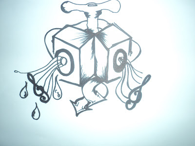
For my idea, i drew a tap, speakers, and flow of water with music notes to symbolize this idea I had. This is a diagram of the piece of work i had drawn and taken a photo of below :


From the above diagram you can see that the tap shows that when it is opened or turned, the 'flow' will not only be water but it will show the flow of music as well. The flow is carried upon from the tap and flows out of the speakers because speakers produce sound so this gives the 'flow' of music pattern. The lines that are shown from the speakers are of the music staff where keys and notes are placed. You can see 5 lines on each speaker and see the music note shown is the treble clef. So this is the rough idea that i had drawn and simply shows the flow of music from the clip that i recorded earlier on.


To enhance this diagram, i took this to photo to a program called Photoshop which I'm quite familiar with.
In this program, i changed the way this diagram totally totally looks like. I first inverted the image which transformed the the lightness or white parts of the picture to a black texture and the marker colors into an orangish/redish color. The reason why i had inverted this was because i had recorded this sound clip at night hence i wanted to give it that night feeling and give out the 'darkness' side on the time i worked on this. Due to also doing at night, i had placed in a few stars on the image just to give it an elegance of night. And to someone that would wonder why i had the stars in the image, I free hand drew a moon to add more detail to it.


I further added raw images to add more detail to my final image. Since i was dealing with a tap and music and water, i collected an image of a tap and also speakers that would help my image.


The above to images are what i used to transform my image. To make these images look fine and a little fixed in my final drawing, i had transformed them by warping them. Warping is a transformation in Photoshop that gives you the option to pull, size, and angle up images. So with this, i warped the speakers and tap to fit into the respective places on my image. Because these images were raw and were going to have the same texture and not blend in properly with the original images texture, i changed the blending options of the speakers to exclusion and decreased the opacity and the fill and with the tap i just changed the opacity and the fill to the desired amount.
Thereafter, i brushed some parts of the image with a blue color to give it that 'water' effect and also colored some of the water droplets with blue and filled some with treble clefs to elaborate the music part.
With all these ideas i had to add onto my pre image, this was the final image that i had finished with the add ons i had added. I also added a text with the label 'music' to show the music concept. This is the image below :


With the above image, i had finished but i know i could improve the idea of the whole work so i approached my lecturer and showed him my work and he advised me that my idea was okay but i could emphasize of the movement of the water and the sound, cleary one can get my final idea but i wanted to be more artistic and hence i came up with an abstract type of work. I drew the top of a sink with the tap and everything relevant and still maintaining the musical idea, i made the end of the tap or should i say the drainage part/hole a speaker. Then i emphasized the flow of water from the tap down to the speaker/drainage. And i maintained the musical effect by adding the staff into the flow of water and also add a few musical notes to this. Hence me coming up with a more refined piece of work.


For me this was my final idea because i had come up with my own idea and then i put it to the test and finished and then with the help of my lecturer, the understanding of the task broadened my thinking and creativity and thats what made me come up with the 'final' piece of this work.

Thursday, 26 July 2012

Workable Piece Of Art

For this given task, we were asked to create a workable piece of art that was to be used or placed on our allocated studio space. We were asked to come up with ideas that make us feel comfortable and at the same time give us that comfort to work well when our comfort 'materials' or 'likes' are around us. In this task, we were told to go crazy and just do anything that comes up to you and gives you that edge to want to come to class and work without any problem.


Brainstorming these ideas was quite easy because our minds were not restricted to anything but we were allowed to do anything, silly, crazy, impossible but just creative at the same time. With that description in place, i came up with my ideas with the interests that i have as myself and these are some of the ideas i came up with.


  1. Music System
  2. Graffiti Wall
  3. Photo-shoot stands with cameras and lights
  4. McDonalds and KFC on speed dial
  5. Robot lights attached to clock and bell
  6. Headset sleep pillow
  7. Cup holder

With each of the ideas that i came up with, they were further explained as to why i had chosen the particular ideas and the reasons are explained below :


  • Music System - because of me having an interest into music and cant pass a day without listening to any type of music i decided that i will bring or have a music system on my work space so that i can enjoy the feel of music as i work.Music helps me concentrate, calm me down and also hypes me up depending what type of genre/music i listen to and thus this music system was going to help me.
  • Graffiti Wall - I love to draw and design anything on anything that i can find i can lay my creativity and so to use this skill somewhere i suggest that i should have myself a graffiti wall where i can just draw anything that i feel is on my mind and paste it up whenever i want to draw.
  • Photo-shoot - Looking clean and fresh is one thing i like to do. To keep my appearance on point is something i like and so to share this interest, i decided to have a mini photo-shoot studio where i can take pics and just feel free and admire my freshness when i dress up for the day and have a pic for that day.
  • Food on speed dial  - Food is one thing i love and hence i can not do without food, so to stop that food necessity from dying i decided to have a telephone on standby that has all the food places on speed dial so that anytime i feel hungry, that phone is not away and i can place my order.
  • Robot lights attached to clock and belll - Well with robot lights having 3 lights red, orange and green and clock telling time and bell making a signal i decided that i should have this on my working space so that when i am in class the light is on red immediately class starts and then when class is half way, the light changes from red to orange and then when class is over, the light changes to green that class is over and done! and then all this attaches to the bell that signals that it is really time up.
  • Headset pillow - i love my sleep and to have this lovable piece of art on my work space i decided to have a limited edition pillow that not only will i just lay my head on it but just incase the will be noise in class, i can jus plug in the headsets by the pillow and i wont hear all that noise and i can have a peaceful sleep.
  • Cup  - Well this is just one thing that i would love to have on my desk that will show organization. I can simply place in my pencils, pens, markers and anything necessary inside.
Now with coming choosing what i was going to come up with or choose to make and see what i was going to have on my space i had to analyze what problem or difficulties i could have with any.

  • The music system was okay because i can have my music playing around me but that would mean i will be disturbing the people around me because the music will be loud and maybe my partner doesnt like noise.
  • Graffiti wall would be cool to have but i cant break down a wall and put it on my work space, partially impossible.
  • Photo shoot equipment requires alot of space for the lights and everything that makes it a photo shoot studio
  • The telephone will need to have a telephone line and have to have a malaysian  subscriber and i will have to be paying bills at such a young age, so that will not work for me at the moment.
  • The robot lights are very huge in size and bringing one in class will be a very big site and will need alot of power to help it be on and all. The clock is workable and the bell can also be got and also workable
  • Headset pillow, buying a pillow with the headphone pieces already attached will not be there of course but i can work around that.
  • Cup idea is fine because can easily purchase one and place my stationary inside.
After analyzing how the ideas will be a problem i now i had to think of how i can make any of these work and choose that be easily worked with.

  • The music system will be included in my budget and that will need financial status to be high and increased so to make life easier, i can just purchase myself a set of headphones/earphones that can have music playing and for that maintain that effect of having the music as work.
  • I would need a bulldozer to break down a wall and place it on my space but i wouldnt need that if i can simply create a wall design on my space, i could simply draw a wall design on paper and let it be my actual 'wall' that i can place my drawings.
  • Photo shoot equipment will once again have to be on a financial budget so to save money and easily take pics whilst im on my work media, i could purchase a webcam or just use my laptop webcam that will take pictures of me. Whenever i want to take pictures of me in class, i can simply turn on my webcam and take a photo.
  • The food on speed dial with me having a telephone in class would be a great idea but because of telephone lines running throw on my desk and telephone bills, i would just use something mobile, and that being my phone. Not much a created design to make but just using on necessity i have already and how it can make life easier. I can simply have the eating places on speed dial ad deliveries can be made.
  • Robot lights are big in size and require quite an above average amount of electricity to keep them running at high performance which i cant manage at the moment and hence working with a clock and bell is what i can implement.
  • The headset pillow would be a good idea because i can get a a pillow and recycle old headsets that i can place in the pillow and have that headset pillow effect and idea i had.
  • The cup will easily be purchased.
With analysis carried out i made my choice on what i would create/use without any problems :
  1. Headsets as my music system
  2. Graffiti Wall
  3. Webcam as photo shoot
  4. Cell phone for food delivery
  5. Headset pillow
  6. Stationary holder (Cup)


The process of making/getting my material are shown here :

  • Headsets


For this, a purchase of headphones was done to have the music effect. Skull candy being my selection due to good sound produced by them.
  • Graffiti Wall 


For this, i just used paper and put them together and made an effect by bricks to give it that wall feeling.
  • Photoshoot 


Using the inbuilt High Defination webcam that my laptop has.
  • Speed dial


Hand held phone was used for this to make the process applicable.
  • Headset pillow


I got a pillow that i wasnt using anymore and i had a set of ear pieces that i wasnt using hence i recycled both materials and made the disired headset pillow.
  • Cup


Simply got a cup that was not in use and then turned it into my stationary holder.

With all the ideas that i had started from the beginning, was to safe say that i broke down from the crazy ideas that i had made in my head and then broke them down to what i would manage by analysis and then came to the making or putting these ideas to work and making them work for me.

Safe to say that my work space now makes me feel much more comfortable to work in and still have that 'entertainment' around me.