Showing posts with label typography. Show all posts

Tuesday, 26 February 2013

Sound Through Visuals

Given the task, 'Sound through visuals', we were told to get one of our favorite songs and then use it through visual media. This source of visual was going to be a grid type of formation.

With that in place, i selected my song and i analysed it and got the tempo of how the sounds would be and what i would use to display on the grid. So first i set up a grid chart with rolls and columns as to where my diagram was to be.
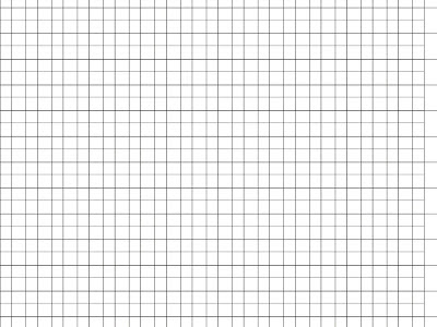

Fig 1. The Grid

After i laid up the grid i then played the song and i was going to use the instruments and the base as a guide line on how i would place the line of the sound visual. The song was more of a slow starting song and then builds up on the chorus and then sets down after the chorus so i was going to do the intro and the chorus and the intro to verse two as it also builds up in that verse.


Fig 2. The Grid With Sound Movement

The sound movement was going to show the pitch or the volume the song hits and u can see clearly that the rhythm is not just steady but builds up from the beginning and then sets in at the end of the high pitch which is the chorus.

The grid diagram was a little too plain and then understanding the pitch rates for me was enough so for that, i further added bars which were going to express the bass of the song. These bars were to be placed at the bottom of the chart and were going to show that this level of a bar shows the pitch is at rate, e.g a red bar  would show that the pitch/bass is at high level.


Fig 3. The pitch bars

With all that i placed from the beginning and analyzing the song and expressing it through this visual, all together final project was shown below. Atleast with first of site one can see that the line can correspond with the bars and can see that his part of the song would be high and this part low etc.


Thursday, 27 September 2012

Alphabet Letter Making

In this given task, we were told to look at any objects around us that give us the resemblance of the alphabet. These had to be taken by pictures and then we form a grid or a pattern and then place all the letters and the should all look like the alphabet and can easily be spotted by someone. 
With that in hand, this was my final idea of all the objects that i managed to take.


REFERENCE FOR LETTERS

A - Bench
B - Stand alone desk
C - Old casket handle
D - Door handle with shadow
E - Art drawing stand
F - Shelf design
G - Fire hose
H - Seats at eating place
I - Vending machine coin slot
J - Umbrella handle
K - Gate of a fence
L - Markings on a sports court
M - McDonalds paperbag
N - Roofing under design
O - Speaker 
P - Lighting box
Q - Satellite dish
R - Button
S - Neon lighting
T - Trench
U - Piecering ring
V - Trees
W - Design on the ground
X - Gate design
Y - Road signs
Z - Old spanner

Thursday, 6 September 2012

Creating A Texture

In this task, we were told to make any piece of art or design that was by the use of natural objects and to refer to how this materials can be used or where the are found. Due to it being natural, we had to use things like sand, flowers, grass, etc.

So for my design, i chose to use sand. I was going to use this sand to come out with a word which was 'desert' why i chose this was because sand is also found in the desert and is also a natural man made artifact so hence i chose that. 
To apply this design, i used glue and piece of paper that i simply wrote down the word desert with the glue and then i applied the sand on top of the glue so that the particles can easily fall/stick onto the paper. There after i added some leaves that i found to add more ''design' to my work, because you rarely find vegetation in the desert, i designed to make vegetation thats found in the desert and that was a cactus. So i simply applied glue and then made the shape of a cactus with the leaves i found. I also added the bush feel to it by finding little dry grass to represent more of the desert feel.


With that being the design i had come out with. I would have come up with a more refined design to show more and maybe have an invert of the sand by having the desert word be left out and the whole place be filled with sand but due to the soggy sand that i found, that was quite for me to complete as well as have having different shades of sand like a desert hence this design for me was one that would show the idea of what was really out there.


Tuesday, 4 September 2012

Typeface That Describes Me

In this task, we are asked to choose fonts that we feel describe us by the way the look and are designed. The font also has to show some characteristics of us personally and we have to explain how the fonts speak to us.

With that taken note, my choice of fonts are as follows :


  • Birth Of A Hero


The font above i feel describes me because it has that cool artistic retro look and me being a guy that is personally cool with anything this font describes me. And the way that it has little pieces off the letters to give it that superhero and futuristic look with a touch of graffiti sense also relate to me because I am one that easily caught with a good sense of graffiti sense and something that catches my eye.

  • El&font gothic

This font definately catches me and describes the artistic side of me. Its a mixture of gothic and graffiti. This font gives the graffiti art inspired i have and one that can easily speak to me because it is like a scribbled down font and since i like to scribble down words and drawings, this font describes that part of me that i can easily come up with an artistic designed word or image.

  • Eccentric Std
First look at this font one can easily see that it has that tall feature and also gives that strong figure that has height and this is one font that i like to use. One reason being that i am kind of a tall person so this gives me that feeling of being broad and tall and also it brings out that ancient type of lettering which speaks to me in a way that i have been through alot in past years and that i still stand tall on my feet. 

  • Throwupz
This font gives me the feel of my music side. I have a passion for music and with this font, it has that artistic feel of hip hop that are normally written on walls and not only does it give the musical feel about me but also the graffiti side i have. So this font is collaborated with the musical and graffiti feel i have a passion feel.